From what I saw, the logos from the blog cgcourse08.blogspot.com, I had pick up a few of them and doing some research about the logos' history, how they form and lots more. The first logo that I choose is the Shell. This is what I found from the google image, the picture of logos of Shell company. The logos was from 1900 years till now. The following design logos of Shell Company :
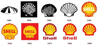
Besides that, I found a lot about the history of Shell company too. The founder of Shell Company was just a little did shopkeeper, Marcus Samuel. The word "Shell" first appeared in 1891, as the trade mark for kerosene being shipped to the Far East by Marcus Samuel and Company. This small London business dealt originally in antiques, curios and oriental seashells. During the year 1901, the first logo was a mussel shell. When 1904, scallop shell or ‘Pecten” emblem had been introduced to give a visual manifestation to the corporate and brand name.
Why they use red and yellow as the colors for the logo? This is because Marcus Samuel and Company first shipped kerosene to the Far East in tin containers painted red. But the link, once again, could be with Spain. When they built up a SHELL COMPANY in Carlifornia, they had to compete with the other companies. As a solution, they choose by using a brighter colors that would not offend Carlifornians. Because of the state's strong Spanish connection, red and yellow of Spain were chosen.
As with the Pecten, the actual colours have been modified over the years, most notably in 1995 when a bright, fresh and very consumer friendly new Shell Red and Shell Yellow were introduced to launch Shell’s new retail visual identity. The Shell emblem - or Pecten - remains one of the greatest brand symbols in the 21st Century.


